Preview Colours 2023
Key colours
Preview Colours 2023
KEY COLOURS
Hello, welcome to the December update of Colour Flow 2022 which is a preview consisting of five colours that are the start of the colour palette for 2023. These five colours function as the base for building on future colour stories. The colours vary from being moody and grounded to being light and airy. If we think about 2023, there are many questions about the future that lies ahead of us. The current global situation is not playing out in the same way from place to place, and most likely, the situation in 2023 will be different from country to country.
The colours are in dialogue about the future; they seem to symbolise different regions in the world; they connect us with other era’s and look into the future backwards. Sustainability and the consequences of climate change influence the colour tones, the move towards biodegradable products ask for a new colour approach and inventive ways of dyeing. These five colours offer a well needed, glimpse of the future horizon. Their positivity comes from strength, confidence and self-awareness, not sunny optimism. The colours are grounded rooted in tradition, while they are unique, they are harmonious together.
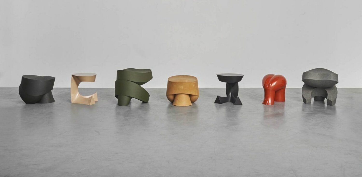
Slow Motion Pieces by Aldo Bakker
Confident Red
OVN-16002
The first of the five Key Colours for 2023 is Confident Red, a bright red that draws attention. It is a positive colour that represents female power and the speed of recovery of the pandemic in the East. In China, red is traditionally the symbolic colour of happiness; it symbolises good fortune and joy. The attention of the West is focused on the East to learn from the speed of innovation. The colour is bright, and the red surfaces play with the light that shines or appears to be projected onto it. The red is fierce and unmistakably demands attention; it has an authentic, rich mood and grounded optimism. Confident red oozes energy and self-awareness and connects history and future.
Darkest Green
OVN-43002
The second colour is Darkest Green which is moody and classic colour that can be used instead of black, dark blue or dark grey. The colour seems to be influenced by condensation; it is mysterious and cavernous. It has a primeval quality about it as if we are going back to earlier faces of human civilisation. Green is often used to symbolise rebirth and renewal and immortality. It is the colour of hope and new growth. While red is the most active colour and blue the most passive; green, in the middle, is the colour of neutrality and calm, sometimes used in architecture and design for these reasons. Nourishing natural greens continue to be relevant for 2023 as consumers focus on balancing mental and physical health.
Warm Earth
OVN-12004
The colour Warm Earth is a balanced, grounded colour, a brown-orange shade that is pleasing to the eye. The colour is reminiscent of the seventies, which was a transformative time in history. An era of change in values that can be inspiring for the challenging times in which we live now. People were looking for ways to solve economic and social problems. Today a new generation of young people and women criticise the Western viewpoint of thinking and the consequences of globalisation and capitalism. The colour sublimes draught and the new conditions of life that lie in the future. The Warm Earth colour is expressive in crafts and hand made materials. The shade has a dry feel but is also impressive on glossy surfaces. Curves and round shapes in this colour express a grounded strength and connects the past to the future.
Blue Mist
OVN-54008
The fourth colour that is defined is called Blue Mist, and this colour is the opposite colour of Warm Earth, these two colours function as the new black and white but with much more dynamic to them. The colours stand for the balance that we are looking for and the journey towards climate-neutral products. The colour symbolises a feeling of air and oxygen; it is a light, tranquil and neutral shade. The colours hold the promise of technology that will offer the solutions to many of today’s challenges; surfaces are cooling and clean. Blue Mist is a colour for lasting products, away from any mood, with a feeling of infinity to the shade.
Silica
OVN-21008
Silica is the last of the five shades for 2023 and is a timeless tone with a trans-seasonal appeal. It has a very subtle yellow and green undertone that gives it a calming and grounding quality. The balancing shade makes it perfect for home, beauty and wellness products. The colour makes you sense the softness of materials; the tone makes smooth surfaces seem warmer, the shade is light but not cold and or clean. Finishes are mostly matt or have a slight sheen. Perforated materials in this colour play with the light. Products made from a mono-material in this light colour are easy to recycle and reuse.
* Pantone TCX reference for closest colour match to the OvN dyed swatches
The PANTONE © reference numbers shown represent the PANTONE © colours most closely related to the Oltmans van Niekerk colours displayed. PANTONE © and other Pantone trademarks are property of Pantone LLC. PANTONE colours displayed here may not match PANTONE - identified standards. Consult current PANTONE Color publications for accurate colour. Pantone LLC is a wholly owned subsidary of X-Rite. Incorporated.
Download the Adobe ASE palette here


