02/ Resonance
Colour
02/ Resonance
SOURCE
A World in Transformation
The world is undergoing intense transformation; we are in a world that is awakening to the importance of empathy and respect for the people around us. Many people feel unvalued and alone and struggle to work harder to prove they are equal and worthy. Resonance is one of the Color Flow 2023 colour stories about human connection and how design can help bring us together. Resonance expresses hope that we will learn to treat each other better, become better allies and support each other in the quest to create a more equal and just world. We can rebuild a world in which all lives are celebrated and where everyone can thrive.
Diversification of the Lens
We can no longer talk about a global world and a shared world view. We know so little about the world we live in and about other people’s daily experiences. Current assumptions must be challenged to enable us to see the world through a different lens and from different viewpoints, making the world of design more inclusive. Conflicts can be resolved by coming together and listening. By respecting someone else’s opinion, we take a step forward towards greater tolerance. If we want to change one-sided views, it is crucial to raise awareness and develop well-balanced, diverse design teams.
Diversity in Design
Designers spend time imagining and building experiences that impact people’s lives, affecting their relationships with other people and how they relate to the world around them. Design is responsible for facilitating more inclusive and diverse experiences. Diversity in design means diversity of experience, perspective and creativity. These can be shaped by multiple factors, including race, ethnicity, gender, age, sexual identity, ability/disability, and location. People of all races and backgrounds should be able to use your product with the same degree of success. It is also important to create an atmosphere in which people of any colour feel comfortable and valued as individuals.
02/Resonance
CONCEPT
Download Adobe Swatch Exchange file here
The Palette
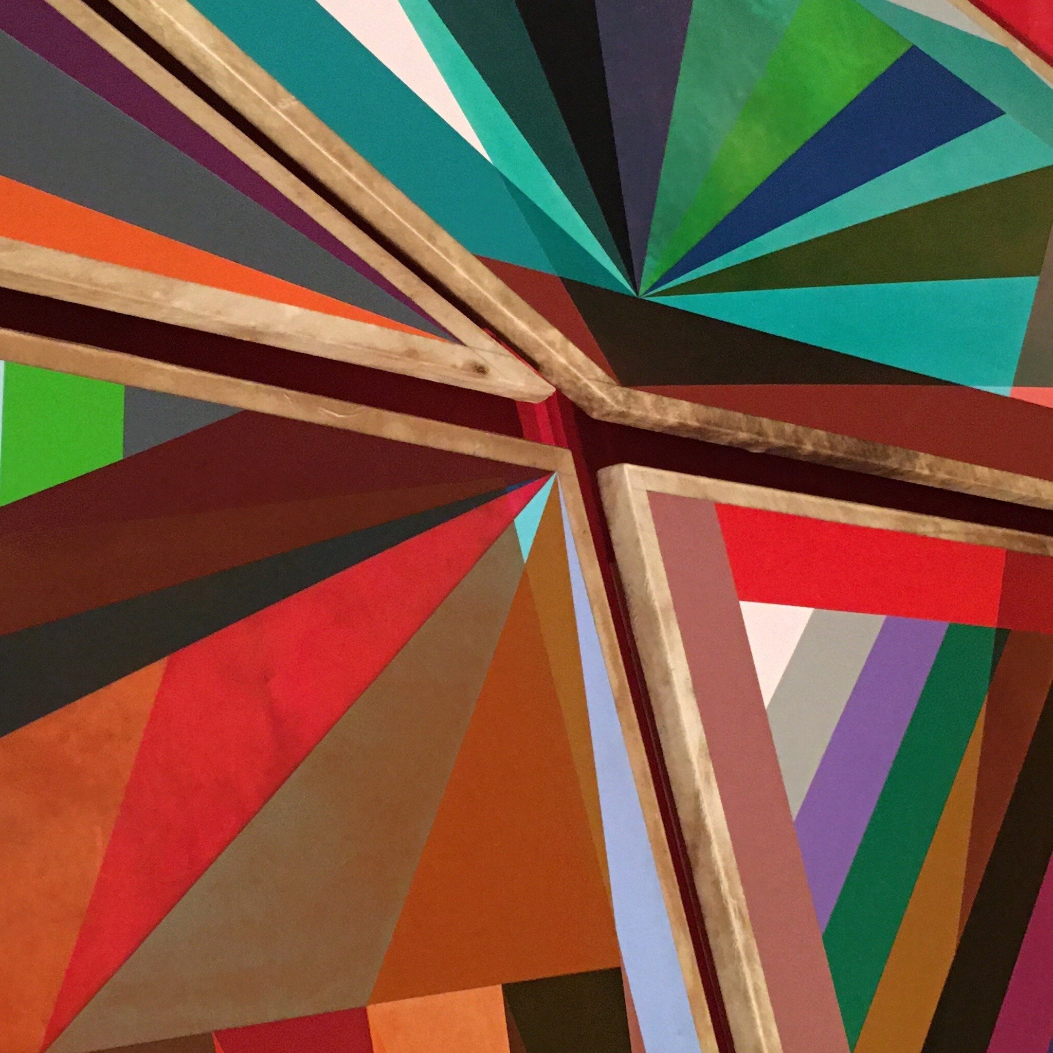
The Resonance palette is warm, featuring red and brown tones. Nuances matter; a search for harmony is expressed by the use of singular, arresting colours. This outspoken, colourful palette has an earthy, grounded touch. The colours are saturated and evoke a feeling of new-found warmth. The beige shade and the dark brown provide the palette’s base. The dark red tone, mid red and two shades of orange can also be used for larger surfaces. The purple, greens, pink and yellow express playfulness and can be used to express and represent individual identity. Make no mistake: while they are warm, tonal colours, at the same time they are power colours that radiate self-confidence and self-awareness; they are designed to make you shine. The palette is harmonious and strikingly colourful, inviting us to stand in solidarity; a neutral stance is not an option.

Key Colour
The colour Brick is a warm red-brown, a powerful colour that expresses a potent strength. While connected to the past, it creates a statement in today’s context.
Colourways
Bi-colour
The bi-colour combinations are tonal and warm, they are expressed in material combinations that are contrasting, the colours create unity.
Warm Pink
Warm pink combined with Brick and Legacy is moody and rich. The Harmony tone makes the combination new and modern.
Shades
The purple Vivid colour and the green Pacific tone are bound together by the dusty light colours.
Purple
Purple Vivid and the stone red Brick together create a warm exciting colourway. Adding the Powder, Harmony and Character colours opens it up and makes it look natural.


