1 Horizon Scanning
Colour
1 Horizon Scanning
Source
Long-term view
Horizon Scanning is the first colour and material direction of Colour Flow 2025. For the future. Low-impact materials minimise the environmental impact and coDesigning for a different future necessitates exploring the horizon, products must last a long time and also be relevant in the future. Horizon scanning is not intended to predict the future, but to research information and detect early signs of change, in order to identify risks, disruption and opportunities. Horizon scanning can be the base for forming a long-term vision focused on progress and can support decision-making in the short and medium term.
Towards closed loops
The materials for Horizon Scanning are aimed at minimising the impact on the environment and contributing to a smaller ecological footprint. Ultimately, circular materials are the goal, with materials that maintain the same quality level. The materials of Horizon Scanning are steps towards optimised closed material cycles, based on the concept of infinite materials. Converting to better alternatives involves simplifying a product by reducing the number of components. A product can be recycled more efficiently if all parts are made of the same mono-material. Easy disassembly constructions are also crucial for recycling processes. Biobased glue to hold particles together increases the sustainability profile of products. Particles and colours from the material's past life may emerge in new use. The smart materials of Horizon Scanning are engineered to block UV radiation, enable heat regulation and harvest renewable energy.
Coloured by waste
The base colour of materials influences the Horizon Scanning colour palette. They are light shades inspired by natural dyes from the waste of fruits, vegetables, compost, algae and fungi. The colours have a calming effect; they radiate peace and tranquillity, and emphasise being one with nature and the Earth. Wearing clothes and using products that are part of a circular future provides the feeling that one's choices positively affect the future. These lighter tones have become nuanced and subdued, embracing the universal symbiotic relationship between humans and nature. Accepting the unpredictability of the outcome becomes part of the appeal of the colour and materials.
Download Adobe .ase file here
About the palette
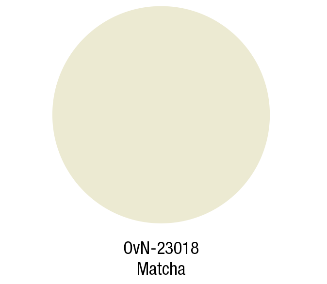
The dyeing method is also crucial for a sustainable product. The dyeing method must be circular, biodegradable, or recyclable for any future product. The previous use of a product also informs the colour choice. The palette’s light Matcha, Blueberry and Rooibos colours are inspired by food waste dyes. Mineral and Fog are calming neutrals, while Euphorbia and Spruce bring the outdoors to the palette in a muted way.
Key Colour
Created through natural dyeing methods, the light green matcha colour symbolises the use of sustainable colour practices that are gentle on the planet and people.
Colourways
Mono colour
Here we concentrate on mono-colour as it is better suited for recycling.
Exploring new aesthetics
In this colour combination the two greens are cooled down by the Blueberry tone and given some warmth through the orange Osage colour.
Soft
Recycled materials give colour to the new materials, a new softness brings together these different tones.
Neutral
The combination of greens with the Fog colour is calming and grounding.


