Colour SS 2023
Update August 2021
Spring/Summer 2023
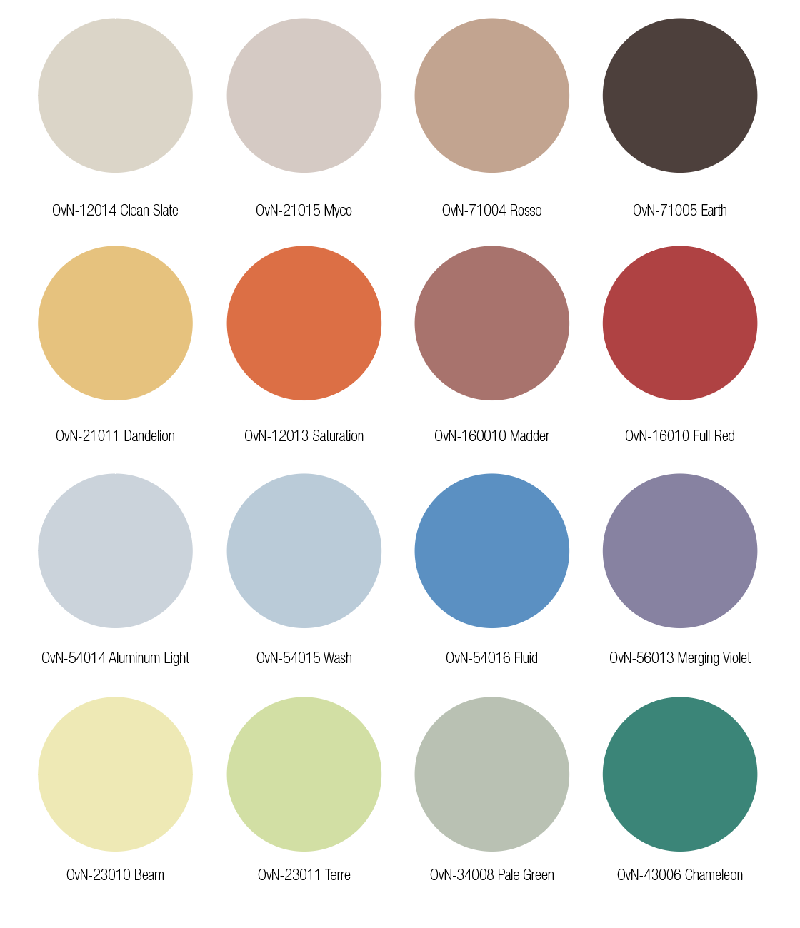
Welcome to the Colour Flow Spring/ Summer 2023 colour update. The sixteen new colours for Spring/ Summer are for home, fashion and sportswear, and can be combined with the colour palette of Colour Flow 2023.
Below, you can see the palette arranged tonally. Essential is the neutral to brown range on top and the yellow towards green colour range below. The palette has both soft and expressive colours; the shades subtly attract attention, some because of their brightness, others because of their unique hue that make you look twice.
The palette has room for individual choices. The neutrals make a statement towards a new lifestyle and long term colour use. The yellow, orange and red range is bright, warm and colourful. The blue and purple tones are calming and airy. The green tones encourage nature's healing and balancing power to filter through into our day through colour use.
All four colour stories are about connection, with the Earth, with all living beings, other people, our mental well-being, and the possibilities of the digital domain.
SS 2023 TONAL PALETTE
You can download the Adobe ASE palette here and download the PDF version here
You can download the images here
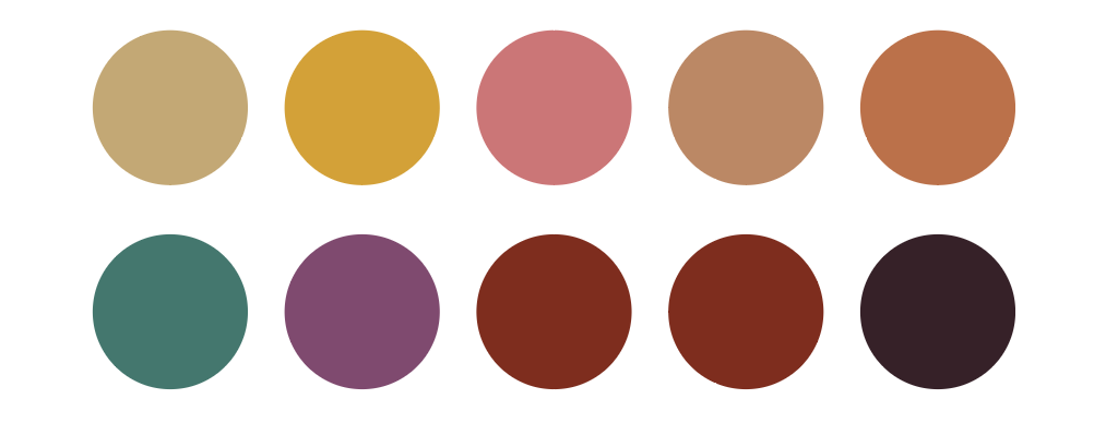
Click here to see the non-seasonal and summer 2023 colours of the original Colour Flow 2023 palette.
1/The Natural Evolution
Within limits
ORIGINAL PALETTE THE NATURAL EVOLUTION
The four new colours for Natural Evolution emphasise the importance of light to all living and non-living organisms on the Earth; they lighten up the Colour Flow 2023 general palette. To create regenerative materials for our products and change towards a post-fossil lifestyle, we need to study natural intelligence and technological solutions and how we as humans fit into nature. The colours express the interconnection of people, biology and technology, light and water.
About the colours:
The four colours have nature as inspiration and are calm yet optimistic. The first colour is a deliberately chosen neutral colour called Myco to express a humble attitude in the complex web of interdependence between humans and nature. Yellow Beam and light green Terre are natural colours that seem to carry light in them. The blue is a fluid blue colour, representing the sky, vapour and water from the air.
2/Resonance
The voice of a generation
ORIGINAL PALETTE RESONANCE
Young people’s views of the world aim to break down barriers and open up minds. The world is in movement; the realisation that our humanity binds us and connects us as part of the greater whole influences the Spring Summer colours of Resonance. Opening countless minds and doors to others positively influence the whole of humanity. The desire to enlighten others and see the humanity in others allows us to heal as a connected collective.
About the colours:
The colours have a solid contrast to them, powerful by themselves but in balance to others. The first colour Clean Slate is a soft and warm neutral colour with a touch of red. The strong Full Red colour stands for strength, vibrancy and energy for change. The Earth brown is a warm and grounding tone, moving away from black and white contrasts to warm brown and ivory combinations. The Pale Green is soft, humble, and the colour of connected life.
3/Culture of Care
Emotional Health
ORIGINAL PALETTE CULTURE OF CARE
The pandemic has made us aware of our physical and emotional health; well-being has become a part of our collective consciousness. Colours can affect our well-being, being surrounded by the right colours can calm down and even provide happiness. Joy is so important to us; a product or environment in a soothing colour can soothe the soul. Harmonious and eye-catching colours can bring cheer and serenity to our everyday lives.
About the colours:
The four new Spring/ Summer 2023 colours for Culture of Care are soft and warm. The pale blue Wash is a tender and tranquil colour that communicates balance and being calm. The yellow Dandelion brings about a sunny feeling that creates warmth and comfort. The warm neutral Rosso reminds us of warm natural materials like wood and wild patterned marble, and the muted Madder colour is seductive and soothing.
4/Synchrony
Digital Culture
ORIGINAL PALETTE SYNCHRONY
The Spring-Summer colours for Synchrony are colourful, they are an expression of the possibilities of creation in the digital world. What is happening now with the virtual worlds can be compared to the early days of the Internet, it is a place for exploration and full of opportunities for innovation and creativity. New interactive worlds are created, blending many different parts of culture. 3D environments and spaces are very immersive, the bright colours of Synchrony want to bring this energy to the physical world as well.
About the colours:
The colours are dynamic, bright and luminous colours, inspired by screen colours; they seem to glow to attract attention. The bright orange Saturation and the green Chamelon are fresh and outspoken colours. The cool grey Aluminium Light is a summer neutral. The Merging Violet is a mid-tone with some grey in it, a beautiful base for the brighter colours.
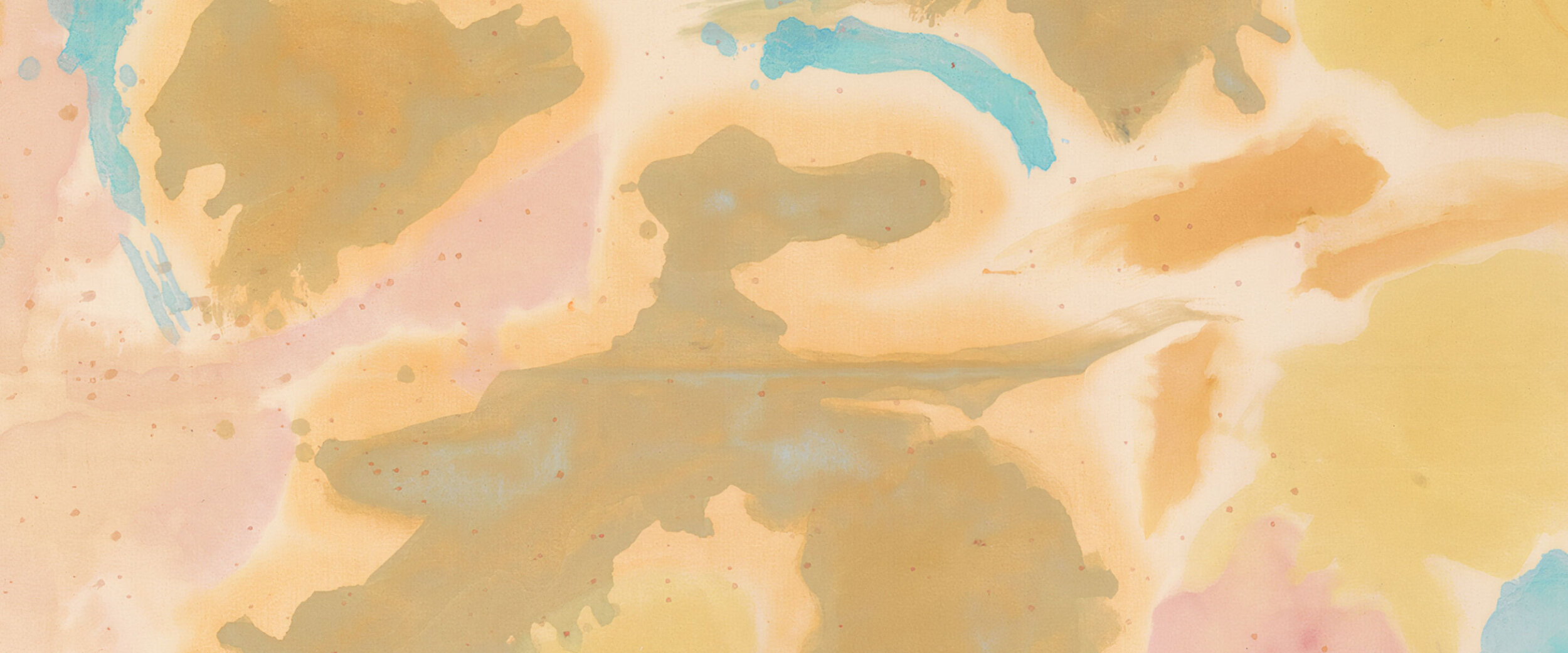
Banner image, Helen Frankenthaler, Detail of Shatter, 1953.
You can download the Adobe ASE palette here and download the PDF version here
You can download the images here
If you would like to order the 16 swatches of the SS 2023 palette you can contact us here


